Every brand starts with a question: What do we stand for? For Evergreen Moose, the answer came naturally. Nature, healing, craft, and the kind of joy that lives in small, meaningful moments.
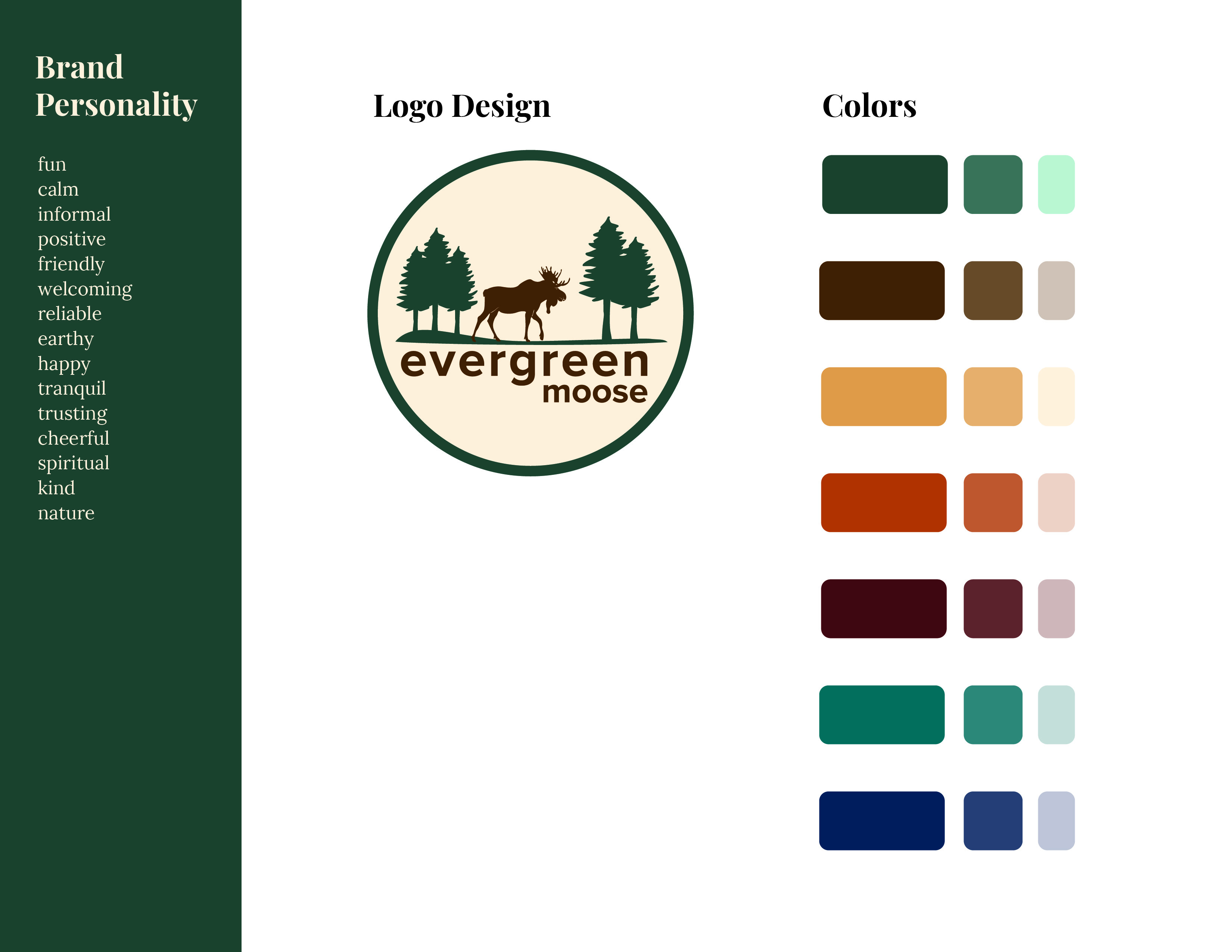
I built the Evergreen Moose brand from the ground up, starting with a logo that felt rooted and alive. The circular badge design features a moose walking through a grove of evergreens, grounded, unhurried, at home in the wild. The color palette pulls from the natural world: deep forest greens, warm browns, golden ambers, teal, and dusty blues. Earthy tones that feel calm and welcoming without being predictable.
The brand personality list (fun, calm, earthy, spiritual, trusting, cheerful, kind) isn’t just words on a page. It’s a filter for every design decision, from the fonts chosen to the way copy is written to how products are photographed and presented.
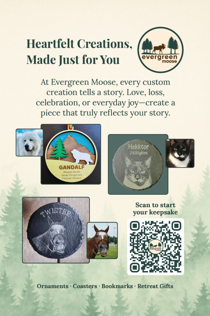
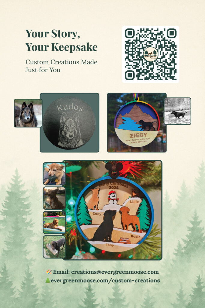
Print collateral extends the brand into the physical world. The market postcard, designed for local farmers markets and craft fairs, puts the full brand story in someone’s hand in a single glance: Your Story, Your Keepsake. Custom Creations Made Just for You.
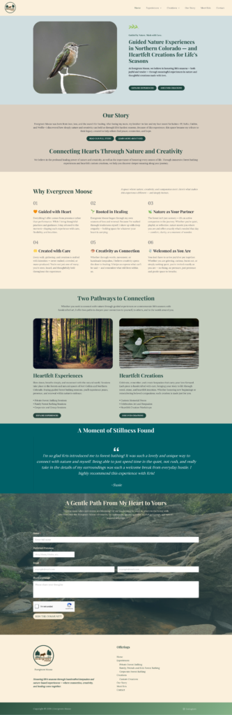
Brand identity, logo design, color systems, print design, copywriting, web design, Adobe Creative Suite, WordPress