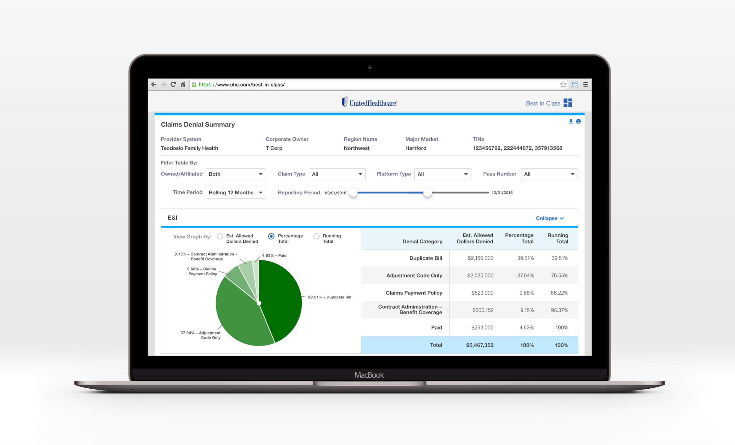
Healthcare data is complicated. The people who need to understand it, including providers, administrators, and executives, are busy and often overwhelmed. Good design can change that. It can take a wall of numbers and turn it into something a person can actually act on.
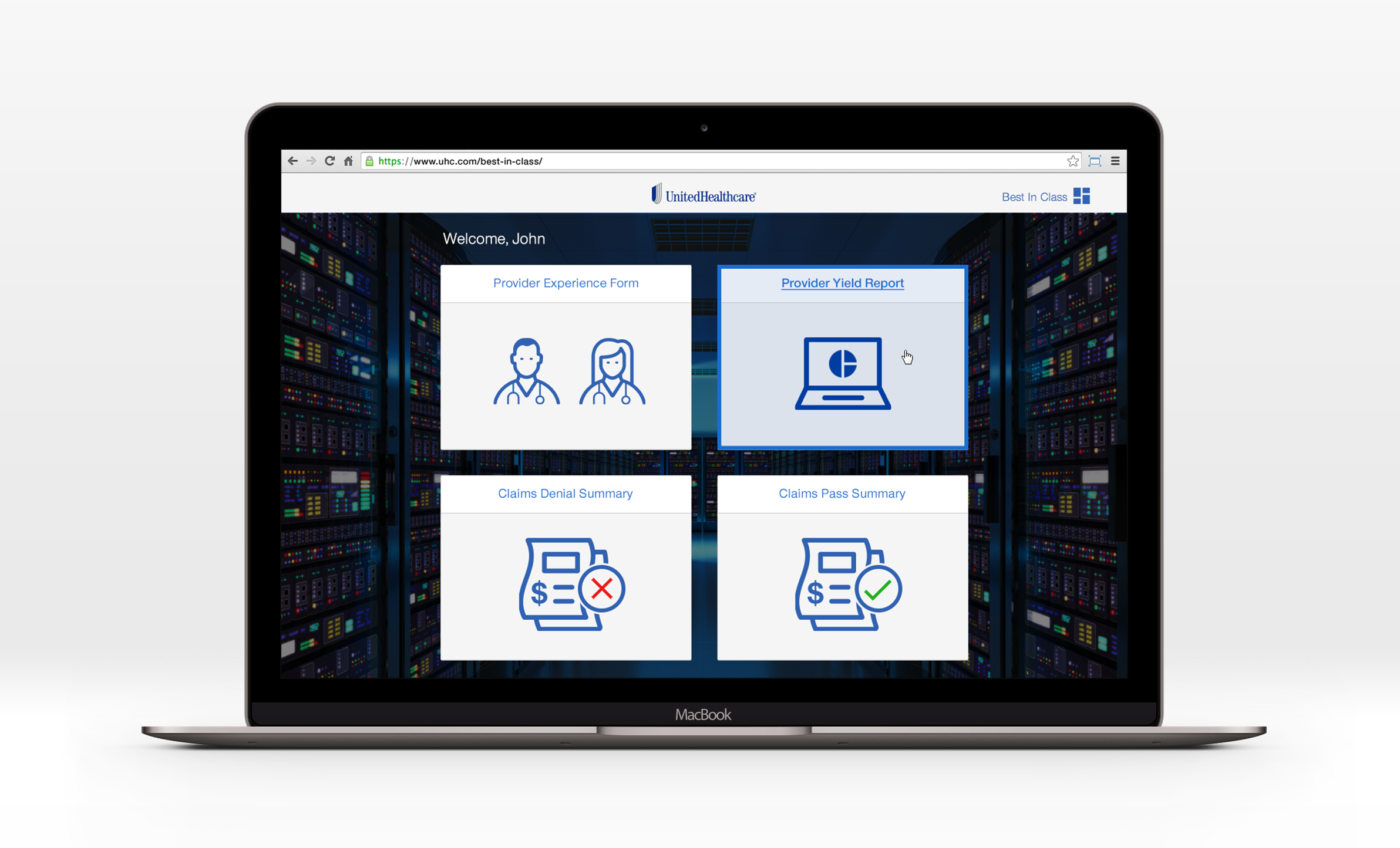
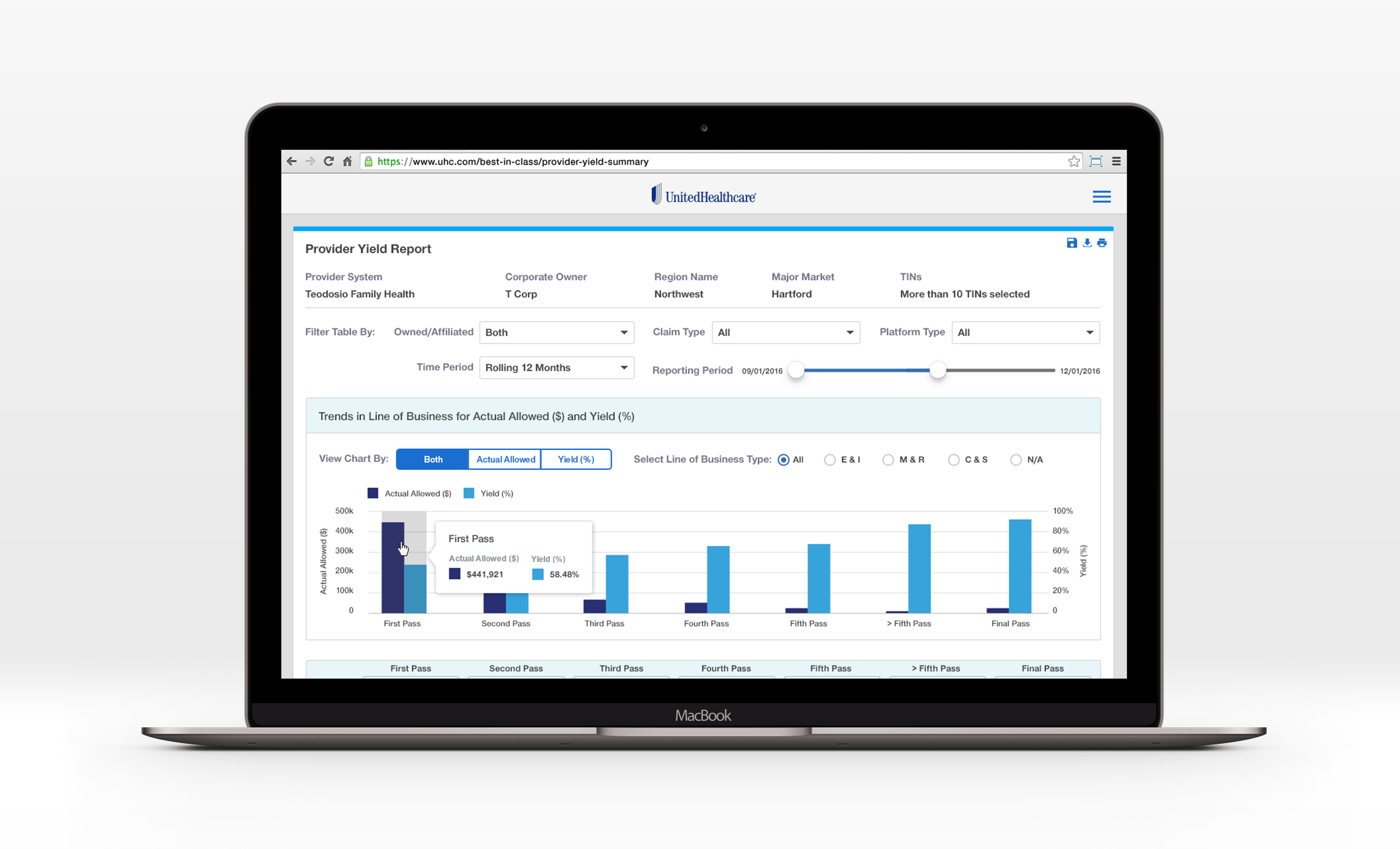
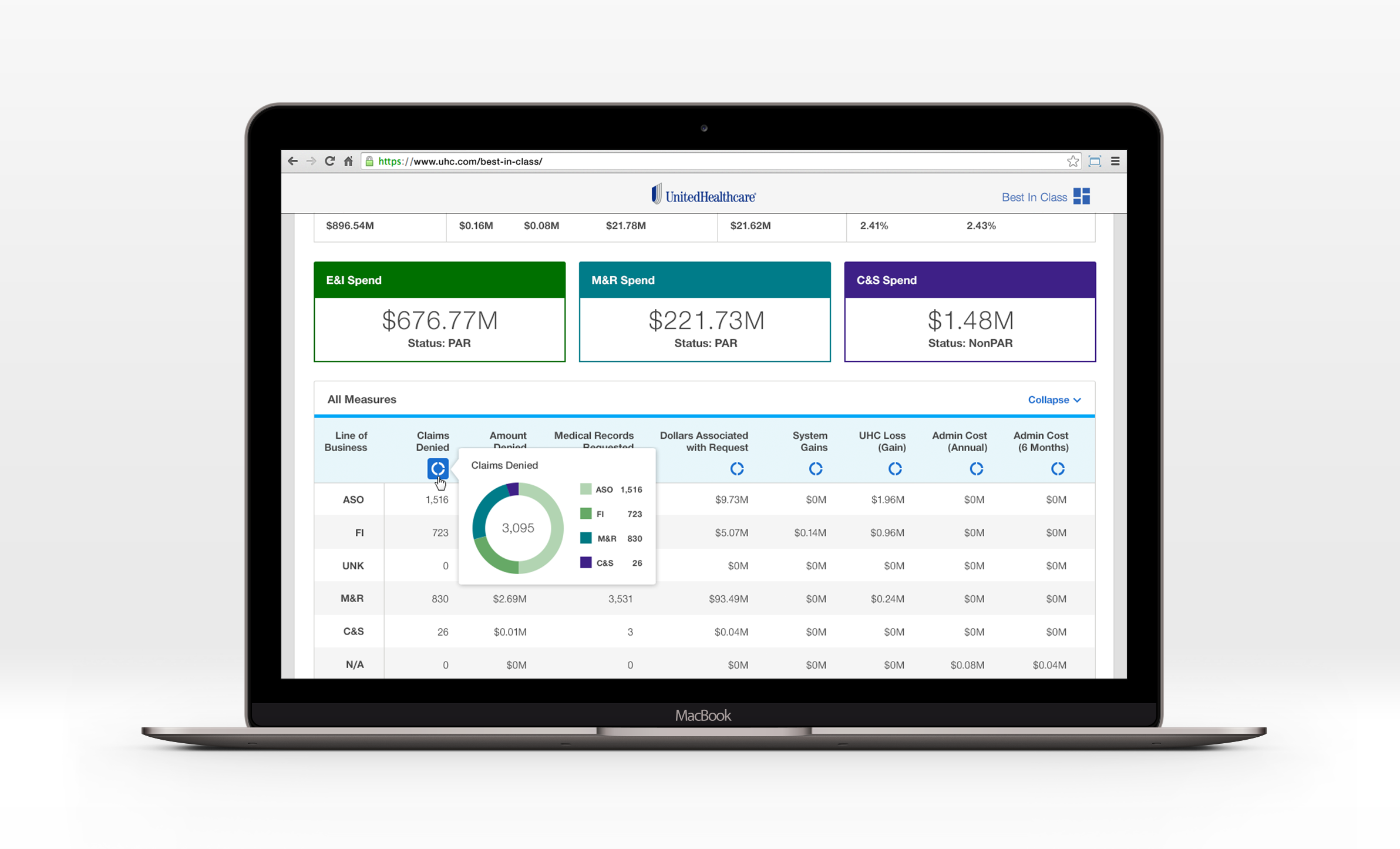
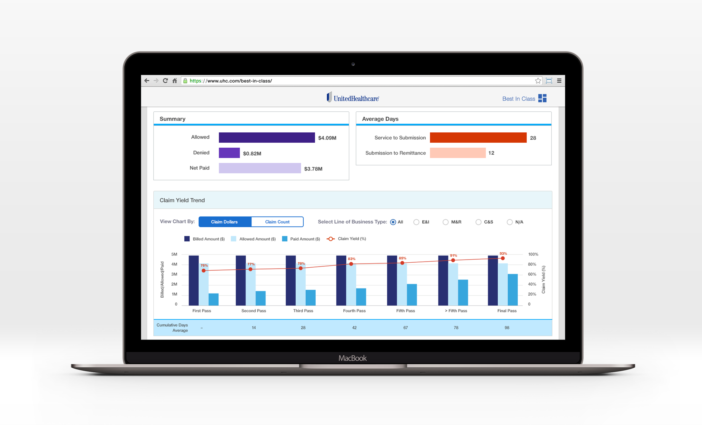
The Best in Class project was an internal data visualization system for UnitedHealth Group executive leadership, a tool that let decision-makers see provider performance data clearly, quickly, and confidently. I designed the full user interface, working closely with the development team to ensure every design decision translated cleanly into the final product.
This project sits at the intersection of design and function in the most satisfying way. There’s no room for decoration when the goal is clarity. Every visual choice, including color, hierarchy, layout, and labeling, had to earn its place by making the data easier to understand.
Skills: Data visualization, UI design, dashboard design, UX collaboration, Adobe Creative Suite, Sketch